Identity | CORVID
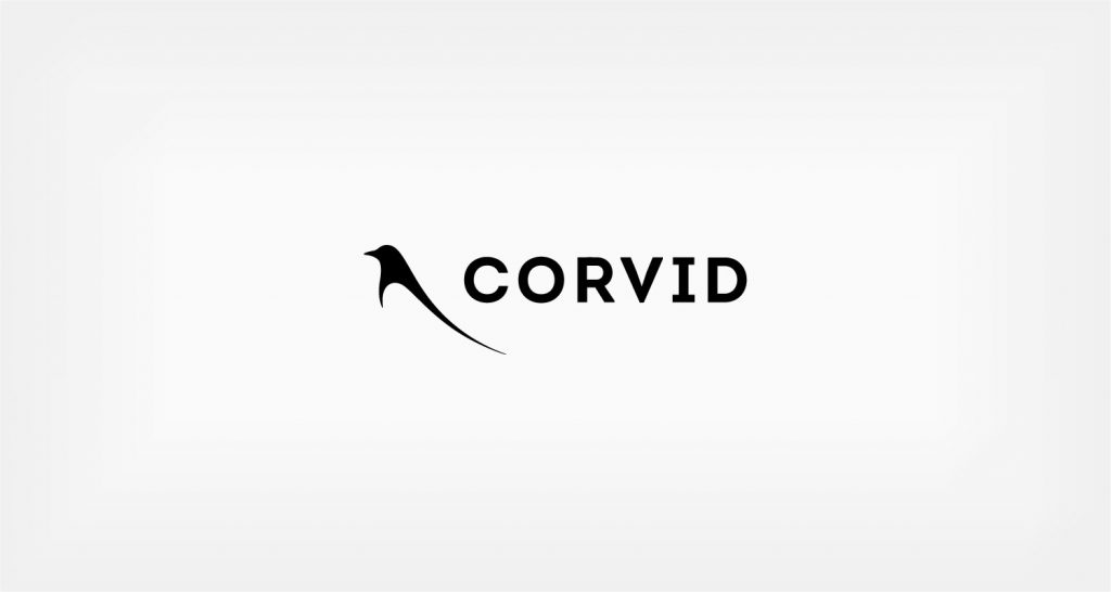
Startup sustainable cycling clothing company CORVID needed a mark that was at once bold and elegant. To achieve that we combined heavy type with an ultra stylized bird (corvid is the family that includes magpies, crows and ravens). Black and white give the logo gravity and allow for very a wide range applications. It also creates a two color feel from the negative space of the birds wing.


