Package Design & Illustration | Whip Smart
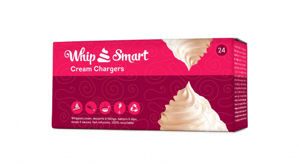
From the name to the logo to the packaging we’ve tried to keep the whip smart ideas coming. Along the same lines as the logo we tried to go for a souped up take on a 50s ice cream truck. Fun, Playful, but so far out that people wouldn’t want it parked in front of their house. We chose pink to upset the dreary norm of cream and beige that other brands in the same vertical rely on too heavily. C’mon folks it’s whipped cream let’s let our hair down a little.
